I seek out opportunities where I can really make an impact. I am an entrepreneur and like to be in an environment where there is a team mentality and we are ready to break rules, take risks and make forward leaps. Having been a designer for so many years, I value collaboration. I know I have found better solutions to problems because of the input I recieved in collaborative environments.
As a designer for almost 20 years, with a background in fashion and architecture, my approach to design has always been user centered. My focus for the last 8 years has been working on products that support small businesses.
Past Company Categories: Small Business Productivity, Local Mobile Advertising, Freelance Photographer Matching Service, Freelance Design Marketplace

CUSTOMER DEVELOPMENT & USABILITY TESTING

DESCRIPTION
Try.com is a browser extension for Google Chrome that puts a "Try" Button on select ecommerce stores. Instead of needing to buy clothes up front, Try.com enables shoppers to try them at home for free.
ROLE
As the Product Design Consultant on this project, I collaborated with the Head of Growth at Try.
CHALLENGE
The client wanted to learn how effective their on-boarding process was and where improvements could be made to the overall experience for their users.
PROCESS

PROVISIONAL PERSONA

INTERVIEW FINDINGS
Attitudes About Online Shopping

"It's a Research Tool"
Users shopped online to do preliminary research on the things they want to buy. They are looking for:
• Trends
• Location of stores nearby that have item in stock
• Items that are hard to find or aren't currently in sseason

"It's a Hassle"
Worrying about checking their credit card bill for charges being refunded and the need to take packages to the post office were their main issues when dealing with online returns.

"It's not Efficient"
A major concern with online purchases was the need to see the item in-person and try it on. They felt it was more efficient to just find a store that carried the item and go there to try it on and purchase.
Motivations to Shop Online

Filling a Void
When asked how they got their inspiration to buy an item, they all cited a situational need that they didn't have in their wardrobe:
• seasonal needs
• special occasion
• travel needs

Inspiration
All stated that they got their inspiration from seeing someone on the street or a friend wearing an item that caught their eye which would then prompt them to look for it online.
Note: none of the users mentioned magazines as a source of inspiration, even after being asked about magazines they read for fashion inspiration.

Brand Loyality
When asked which online stores they purchased from, they all mentioned Nordstrom’s. Reasons included:
• Familiar return policy
• Have a Nordstrom’s credit card
• Easy to filter/search on their site
• Have most of the brands they like
USABILITY TEST FINDINGS

The tagline got their attention but everyone tried clicking on objects that were visible to them to find more information
This bar looked like a border to the page and did not appear to scroll
Finding:
Not initially, all participants missed that there was more content below the fold.
Client Concern:
Do they understand what we do from the home page?
After being instructed to scroll down, everyone could easily describe what they thought Try does.

Since two of the users were avid Pinterest users, they were able to quickly understand they were adding an extension similar to how the Pinterest “Pin It “ button worked
One user did not scroll past this point, so she did not see the rest of the explanation about returns
Finding:
Trust & Logistics
Client Concern:
What are user's hesitations about using Try?
TRUST

Facebook Signup
Users weren’t sure how Try would use their personal information or how Facebook would use the information gathered by Try.
Email Signup
Hesitant to give email because they aren’t convinced of the value enough at this point to put up with “spam”.

Credit Card Info
Don’t want to enter credit card until they think they might find something they would order.
Chrome Permissions
Being asked for permission to “access and change all your website data” was scary to them.
LOGISTICS

Return Policy
• Users could not recall the return policy or did not see it before, wwhich made them reluctant to click on the “Try” button.
• They questioned when their credit card would be charged.
• Started to wonder how this is different than just ordering from t the store and dealing with them directly.

Hassle of Returns
This is obviously not unique to Try, but because it is implied that this is not a final purchase, users began conjuring up images of returning things to the post office.
Finding:
There is interest, but they want more…
Client Concern:
Do they want it?

There was a little disappointment that the button only worked on these sites
Especially since they were not familiar with about a third of the list
No one was interested in using the chat box.
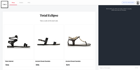
Everyone just started scrolling looking for an item they might be interested in.
No one made the connection that these groupings all came from the same store.
Everyone wanted to filter the items they were seeing to minimize the number of results they were seeing to what was relevant to them
RECOMMENDATIONS
HOME PAGE

make this a sign-up
& login button
make this an active button that takes you to the demo page
This button should also take you to the demo page
change this bar to white and add arrows indicating that there is more content below
SHOPPING PAGE

Ad an active homepage, following normal convention, users expect to be taken to a homepage
Redesign the group containers so that the titles and descriptions are more visible and explain better what it is people are looking at
Collapse the chat box, the dark box was either ignored or thought to have another purpose. It is also oppressive due to its darkeness and proportion to the rest of the page
Make thumbnails smaller. Images are very large and on some screens you can only see 3 products at a time, this contributes to the lack of context when scrolling through groups

Add filters: Stores, Brands, Shoes, New Arrivals, Trending, Dresses, etc.
It takes too long for users to find anything relevant to them with the random continuous scroll
This bar needs to more obviously imply what “see more” means. Users weren’t ready to be directed away from try.com
OPPORTUNITIES
Users perceived try.com as a shopping destination
AREAS TO EXPLORE
Shopping Cart Aggregation
Bookmarking
“Try” Queue
Recommendation
Social Sharing
Return Shipping Experience


